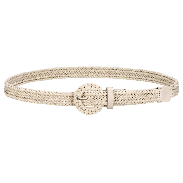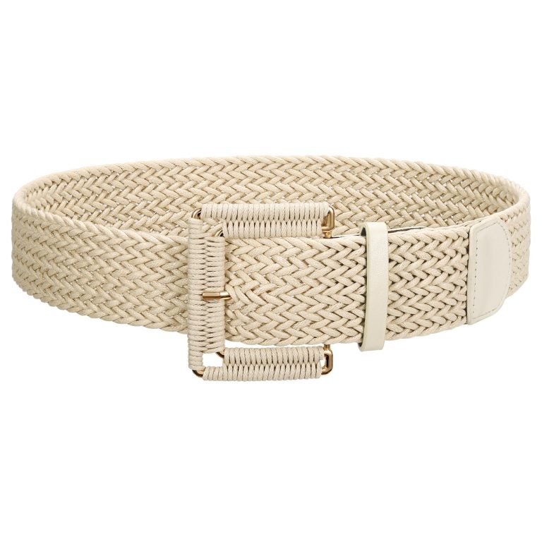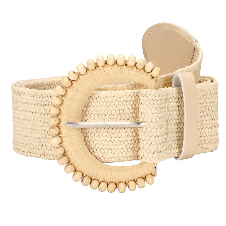
The JASGOOD colour edit offers two ways to read a finishing detail: let it echo something already in the outfit, or let it introduce a contrast. Neither approach is a permanent rule for your wardrobe.
Begin with the garment you want to wear. Its colour, pattern and amount of visible fabric give a belt its context; an accessory swatch by itself cannot tell the whole story.
In this story
The JASGOOD colour edit: choose the relationship first
A close colour relationship can allow a buckle or texture to become more noticeable. A stronger contrast can make the belt’s position across the outfit easier to read.
Use the JASGOOD women’s belt collection to explore possible directions. Check the selected product’s actual colour options rather than assuming every pictured look is available in every variation.
Compare the strap and hardware together. Two belts described with the same broad colour name may create different impressions because their surfaces or front details are different.
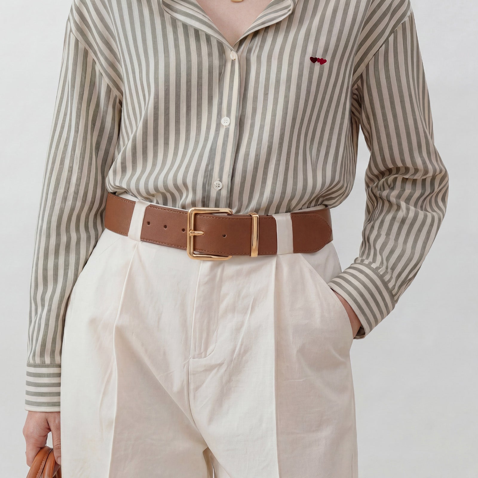
Echo does not have to mean identical
You could repeat a dark note from a print, a warm tone from a bag or the quieter side of a two-colour outfit. The connection can be partial rather than an exact match from head to toe.
This gives the eye a relationship to follow while leaving some variation in the look. It can be useful when you want the belt to connect pieces without becoming the first thing someone notices.
Try the idea against clothes you already wear. A colour relationship that looks appealing in isolation may feel different when the full area of the garment comes into view.
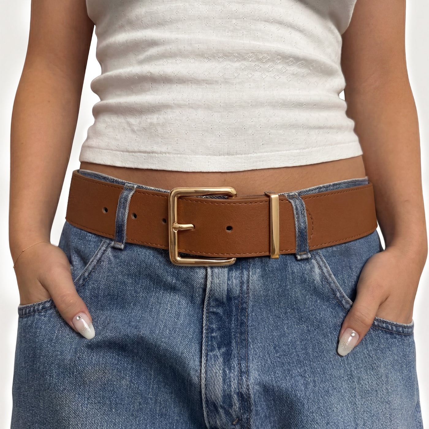
Contrast can be small and deliberate
A contrasting belt does not need to be the brightest item in the outfit. The difference might come from light against dark, a warmer note against a cooler one or a visibly different surface.
For a broader visual line, explore the wide belt collection. More visible area changes how strongly a colour contrast reads, even before a buckle becomes part of the picture.
If that effect feels too emphatic, change one thing: the colour relationship, the width or the placement. Comparing one variable at a time makes your own preference easier to recognise.
A comparison that keeps colour in context
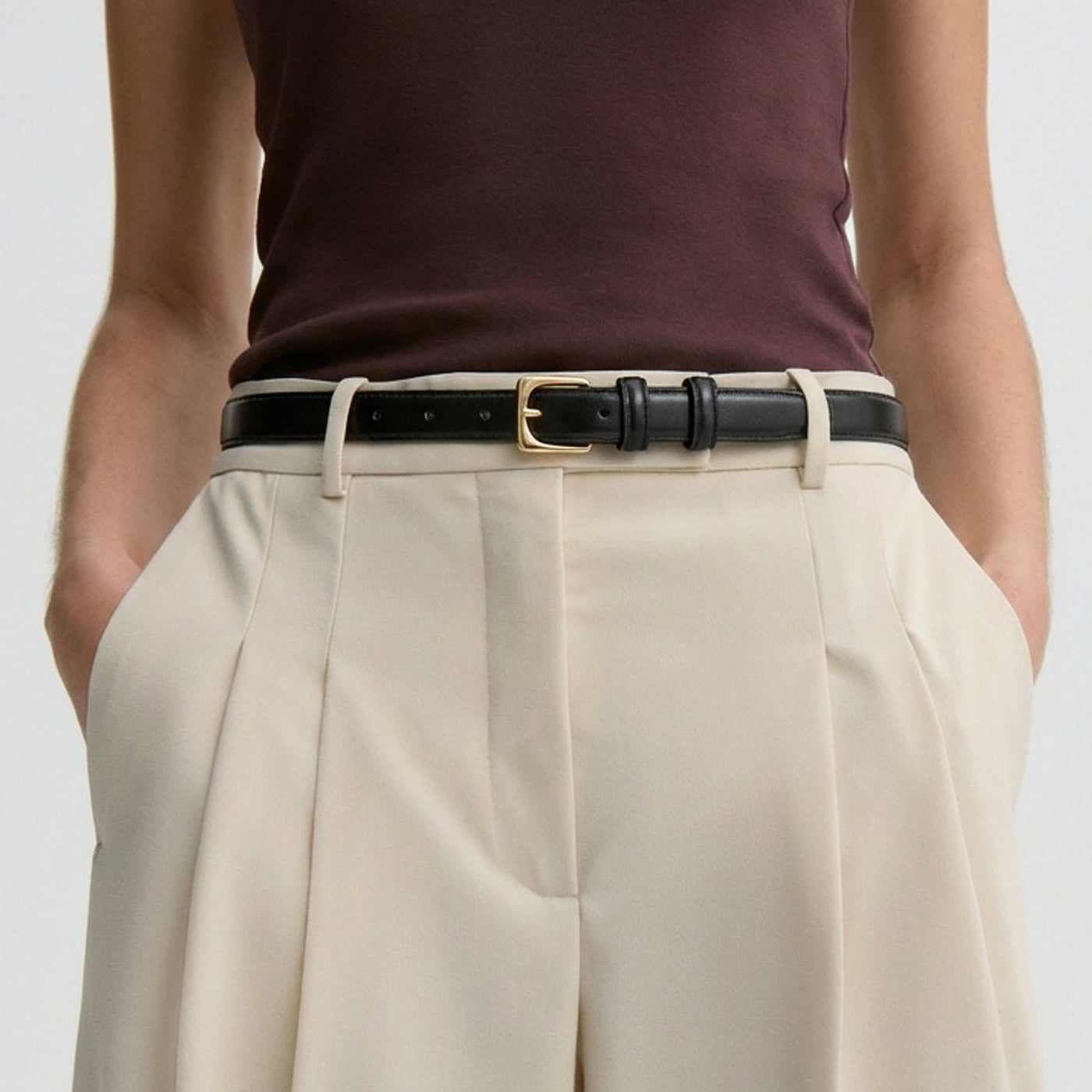
Lay a possible belt against the garment before introducing shoes and a bag. Notice the size of the colour area, not just its name: a narrow black line and a broad brown band can play very different roles against pale fabric.
Then step back to a full-length view. A small contrast that looks bold close up may become a quiet connection in the complete outfit. Conversely, a broad band can create a more obvious division than a small swatch suggests.
If you want an echo, choose one existing detail as the reference rather than matching every accessory. A dark note from a print or a warm tone in a bag can be enough to make the relationship readable.
For contrast, change the belt before changing the whole outfit. Keep the garment, lighting and camera position similar if you compare photographs; otherwise differences in the pictures may disguise the effect you are trying to judge.
Look again at the hardware before deciding. A gold-tone front can introduce warmth even when the strap itself is dark, while a smaller buckle may let the band carry most of the colour relationship.
Record the effect you prefer in ordinary language: quieter division, clearer waist line or repeated warm note. That description remains useful even when the next product uses a different colour name.
Keep room for the real-world view
Screen settings and lighting affect colour appearance. Use product photographs as a reference, not a promise that a tone will look identical on every display or beside every fabric.
The styling guides offer combinations to explore. The useful outcome is not perfect obedience to a matching rule, but a clearer understanding of the effect you enjoy.
Echo can connect an outfit; contrast can redirect attention. Let the JASGOOD edit open those possibilities, then give the final colour decision to the clothes and the person wearing them.