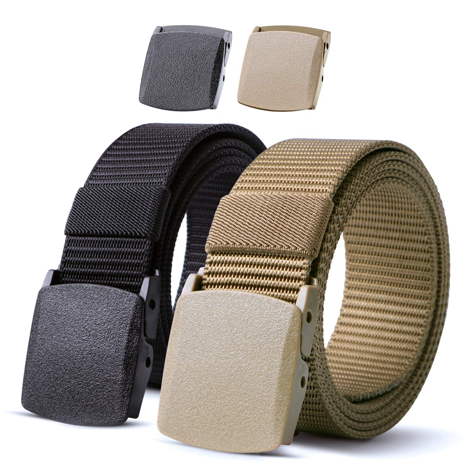
JASGOOD utility buckles do not all create the same amount of visual activity. The flat fronts on the black-and-khaki pair read as broad plain panels; the gray front in the outfit image is divided into smaller horizontal-looking areas.
Both belong to a webbing-led visual vocabulary. What changes is the amount of information concentrated at the center, and how clearly that center separates from the surrounding strap.
In this story
JASGOOD utility buckles as small graphic objects
The black-and-khaki product image gives each belt a front that broadly follows the strap’s color. A gently rounded rectangular boundary is easier to notice than any elaborate decoration.
Those plain faces leave much of the texture to the webbing itself. The horizontal ribs continue beside the front instead of competing with a second busy pattern.
If you want to compare that relationship directly, open the JASGOOD nylon collection and look at the front together with the short span of strap beside it.
The gray-front outfit offers the other end of this particular comparison. Several divisions make the face more articulated, while its lighter tone separates it from the black band.
Neither image needs a dramatic lifestyle story to explain the difference. One central panel is comparatively plain; the other presents a denser cluster of lines.
That observation is more exact than saying every utility-looking buckle is large, aggressive or visibly complicated.
Read the spaces around the front
In the product pair, the coiled straps leave the whole fastening area available to view. Their plain fronts can be compared without a shirt hem or trouser loop covering them.
The outfit photograph is more crowded. Belt loops, the waistband and an adjacent radio all add shapes around the gray front, so the waist area has more visual information before the belt is considered.
Do not attribute that entire busy appearance to the buckle. Mentally separate the gray face from the nearby objects, then compare it with the quieter product portrait.
The change of setting is useful, but it is not a controlled test. The photographs show different belts in different arrangements, not one belt improving or worsening an outfit.
Where a garment loop covers part of a front, describe only divisions whose boundaries remain visible. A dark patch alone does not establish an opening.
This prevents a utility label from supplying imaginary mechanics to a design whose exterior is the only verified subject.

Choose where the outfit’s detail should sit
For an outfit already carrying several visible accessories, a relatively plain panel might let those objects remain distinct. The black or khaki front in the pair suggests that quieter possibility.
A divided front can instead become a compact focal detail within an otherwise plain band. The gray face shows how several short lines can be contained without a decorative emblem.
Try comparing your intended belt with the actual waistband and loops, not just an isolated picture. A plain front may be partly hidden, while a lighter border could remain visible.
If the question is how much detail to introduce, write down the kind of line you want: one broad panel, a narrow border, or several visible divisions.
A utility-looking product does not have to become the theme of the whole outfit. You can choose a specific graphic effect without borrowing an outdoor or occupational identity.
That leaves room for personal preference rather than assuming every practical-looking front should look as technically complex as possible.
Keep appearance separate from equipment claims
The current product names include ratchet and tactical wording, but the photographed objects are not evidence of a carrying capacity, retention standard or approved professional use.
The radio in the outfit image should not become an instruction to attach equipment. The image establishes that the prop is present, not that the product was tested for that task.
Check the exact chosen listing for fastening information, stated width and size labels. A familiar rectangular exterior does not prove that two models release or adjust identically.
For practical comparisons beyond the visible face, use the buying guides rather than treating this image reading as a technical specification.
Finish with a clear distinction on your shortlist: the exterior detail you prefer, and the separate practical requirements the selected product still has to meet.
Shortlist JASGOOD utility buckles by the amount of detail at the front: a broad plain panel or several smaller divisions, with practical requirements checked separately.