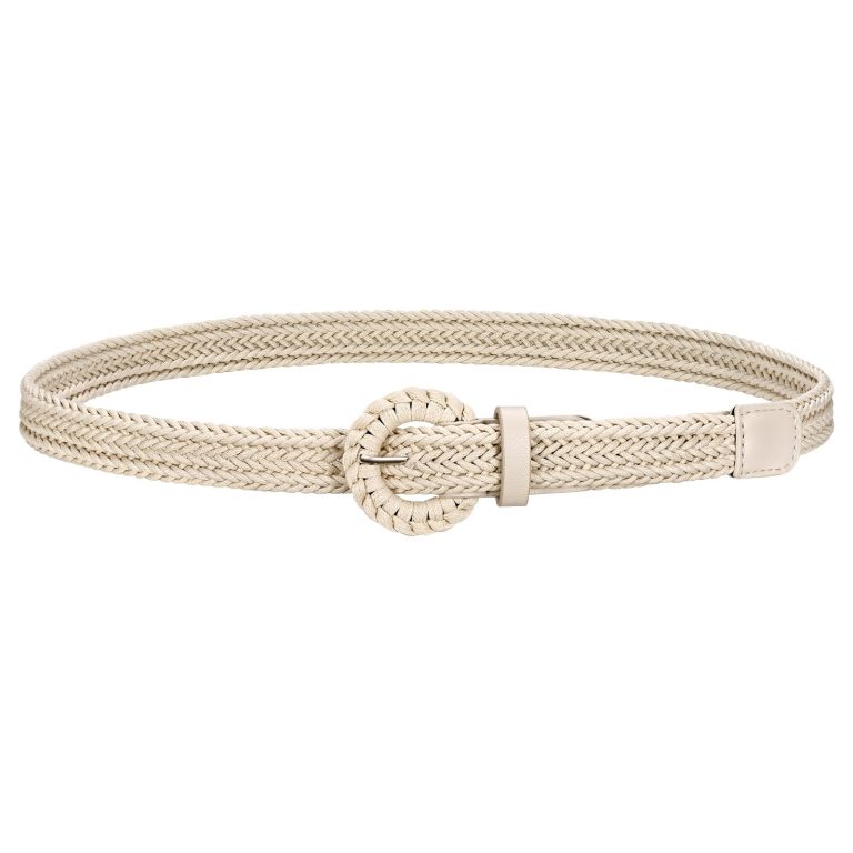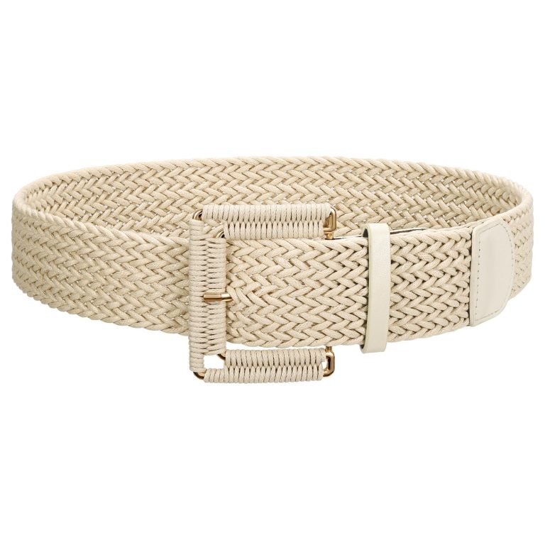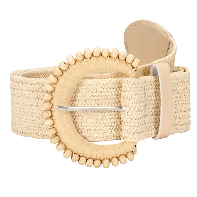
The JASGOOD design language can be explored through a simple question: what do you notice before the shine? Look at the buckle’s outline, the space inside it and the width of the strap.
These elements create a relationship with the clothes around them. A buckle can echo a rounded neckline, interrupt a long vertical line or sit quietly against a similar colour.
In this story
Reading the JASGOOD design language through shape
In the brand’s account of its beginnings, the saddle buckle is a central design reference. It offers a way into the story without describing every JASGOOD belt as the same design.
Read that reference as an invitation to look closely. Does the buckle make a compact focal point, or does the strap carry more of the visual weight? Neither answer is automatically better.
The JASGOOD wide belt collection is a useful place to compare those relationships. Consider the front detail and the surrounding band together, rather than judging the buckle in isolation.
For a different visual vocabulary, explore JASGOOD chain belts. There, repeated links or connected decorative elements can become part of the line around an outfit.
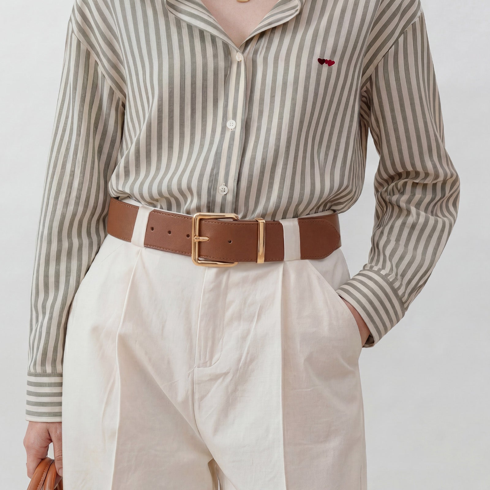
Notice the space, not only the metal
An open frame allows the strap or clothing behind it to remain part of the picture. A more solid front detail can read as a stronger block. That difference can matter even when two buckles have a similar outer shape.
Try reading the whole outfit in a mirror, rather than looking only at a close-up. A detail that feels prominent in a product photograph may appear quite restrained against a jacket or a patterned dress.
This is an editorial way of looking, not a claim that a particular shape flatters every body. Your clothes, preferred belt position and comfort all change the result.
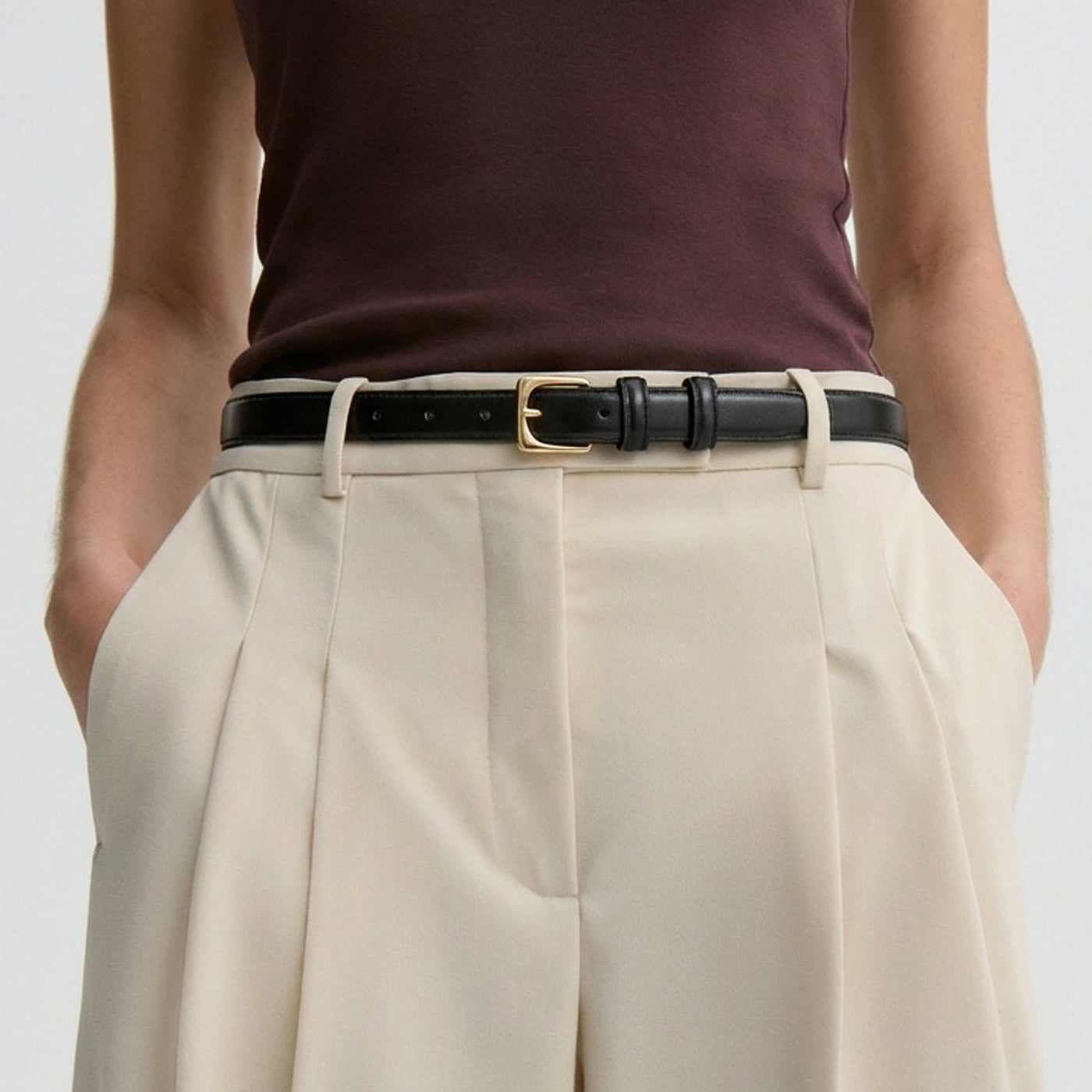
Let contrast set the volume
Imagine a dark belt against dark trousers: the shape may emerge mainly through its buckle. Put a contrasting strap over a pale shirt and the band itself becomes easier to notice.
You can repeat a metal tone already in your jewellery, or deliberately let the buckle stand apart. The useful choice is the one that supports the outfit, not a requirement that every visible metal match.
Keep one variable in mind as you compare: shape, width or contrast. Changing everything at once can make it harder to see which detail you actually prefer.
Compare two outlines, then step back
Place two possible accessories beside the same garment, or compare photographs at the same scale. First cover the strap with your hand and notice the buckle outline. Then look again with the complete band visible.
This separates two questions that are easily confused: whether you like the front detail and whether you like the line it creates across the clothing. A favourite buckle does not always make a favourite complete outfit.
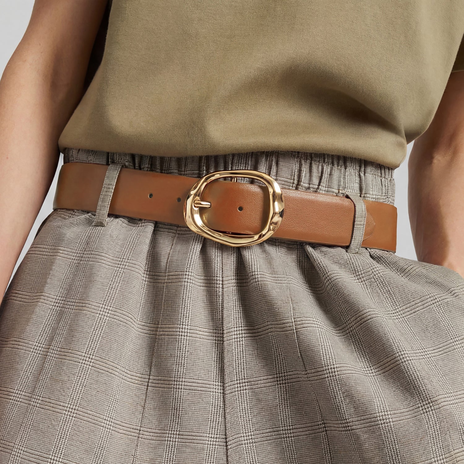
Next, move from a close view to a full-length mirror. An irregular gold-tone front against checked trousers might read as a small interruption at a distance, even when it dominates a cropped photograph.
A narrow black strap against pale trousers offers another relationship: the horizontal contrast can remain clear while the buckle stays relatively restrained. Neither photograph establishes a universal rule about elegance.
If the outfit already has a prominent neckline or large print, decide which detail should lead. Remove one competing accessory before concluding that the belt itself is wrong.
Finally, keep a note of the reason for your preference: open space, rounded edge, visible band or quieter contrast. That vocabulary is more useful for a later choice than a vague instruction to find something stylish.
From a design reference to your own choice
A photograph can suggest an effect, but it cannot confirm your size or how a fastening will feel. Check the chosen product’s measurements, materials and closure before treating its appearance as a buying decision.
Continue with the Journal’s styling guides for outfit ideas, or its buying guides for practical comparisons.
The point is not to reproduce one brand image exactly. It is to recognise a detail that interests you, then decide how much space you want to give it in your own wardrobe.