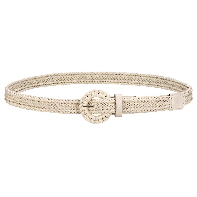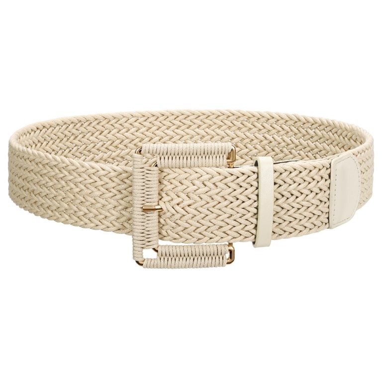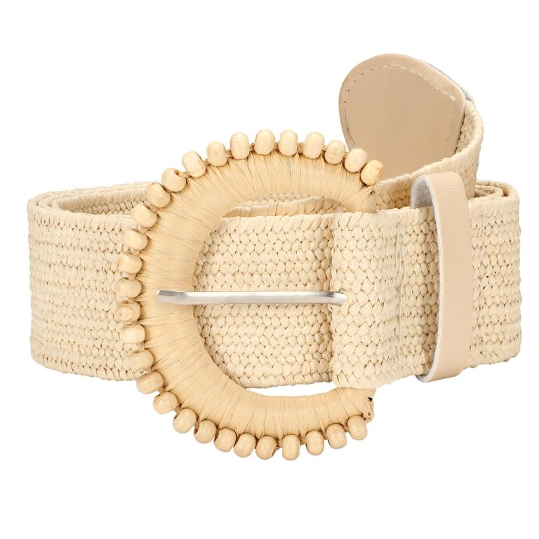
The JASGOOD woven belt edit brings texture into focus. Instead of reading a belt only as a band of colour, notice its repeated pattern, the small changes in light and the way that surface sits beside clothing.
A woven-looking detail can change the character of a plain outfit without needing a dramatic buckle. Its interest may lie in repetition rather than shine.
In this story
The JASGOOD woven belt edit: distinguish texture from material
Woven accessories are often pictured in warm-weather settings, but a texture is not a weather forecast. The surrounding clothes determine how the reference is read.
The JASGOOD straw woven collection is a place to explore that visual direction. Compare the surface and the front detail before deciding how it might relate to an outfit you own.
The collection name is not a substitute for the individual material description. A photograph that looks straw-like cannot establish what a belt is made from or how it should be cleaned.
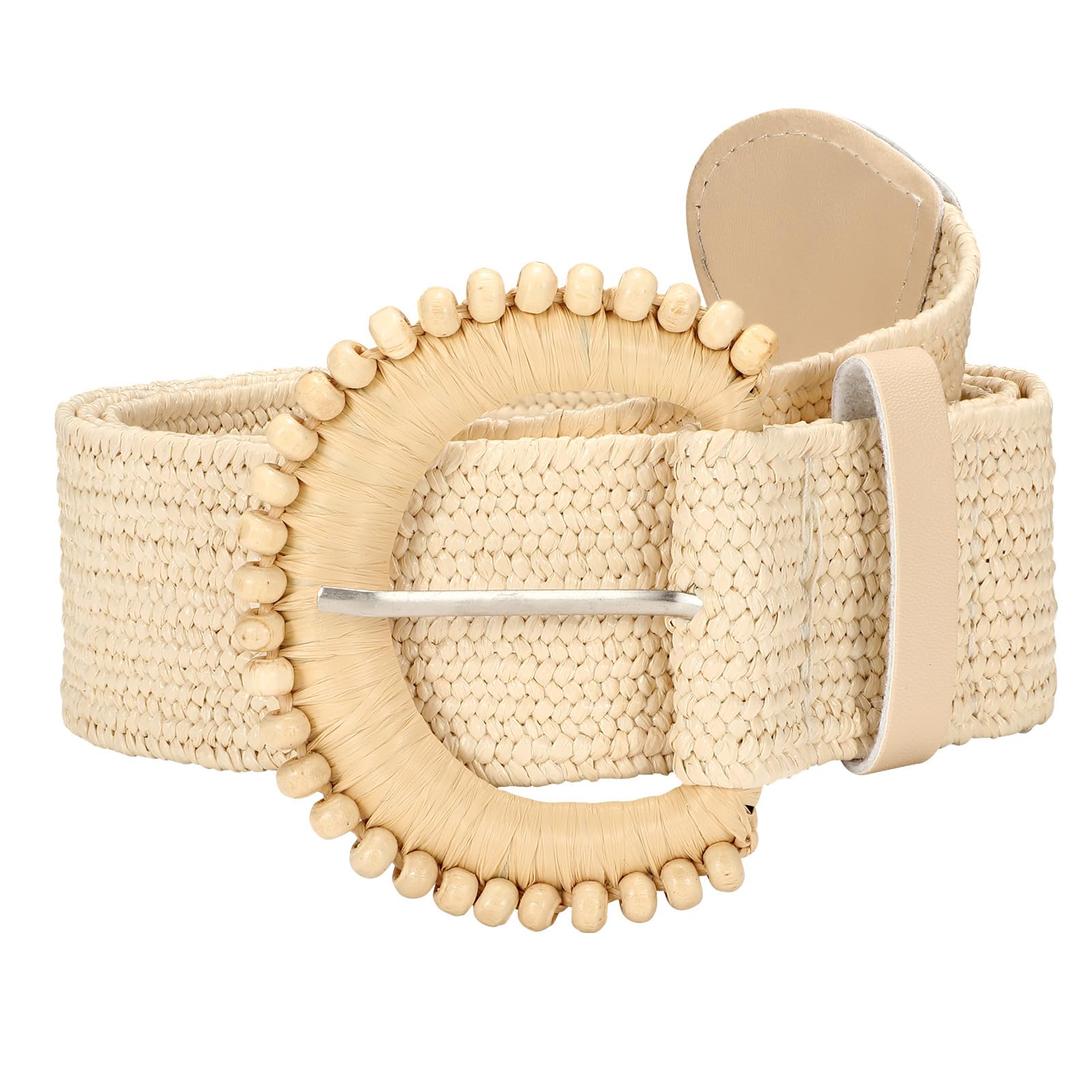
Give texture a clear neighbour
Imagine a woven-looking band against a plain cotton shirt. The relatively simple area around it can make the surface easier to notice, even when the colours are close.
With a patterned garment, decide which pattern you want to read first. You might prefer the belt’s texture to remain quieter rather than asking both elements to compete for attention.
For a different contrast, compare a more tactile-looking belt with a smooth jacket. This is an invitation to look at surfaces together, not a rule that every outfit must mix textures.
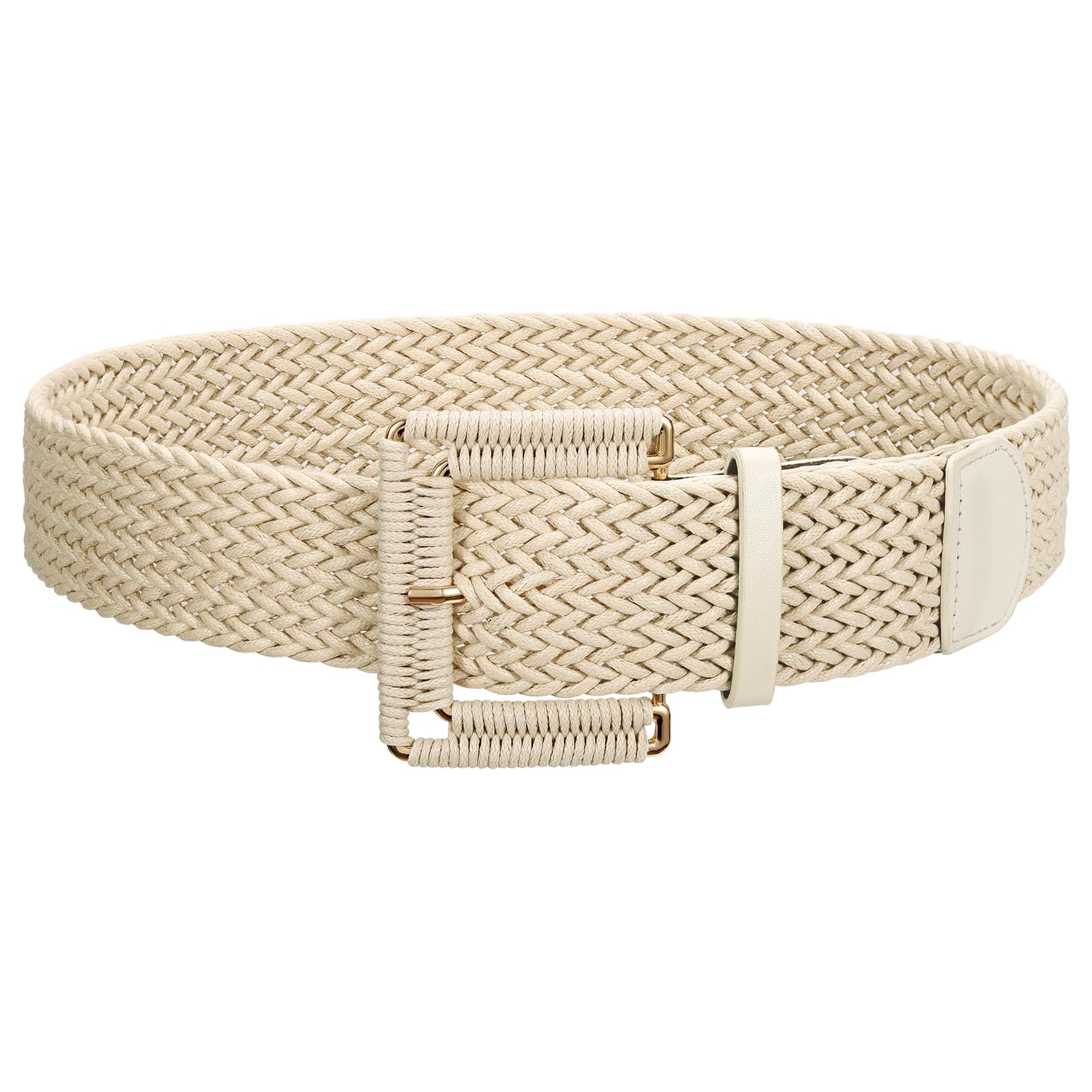
Let the image suggest, not promise
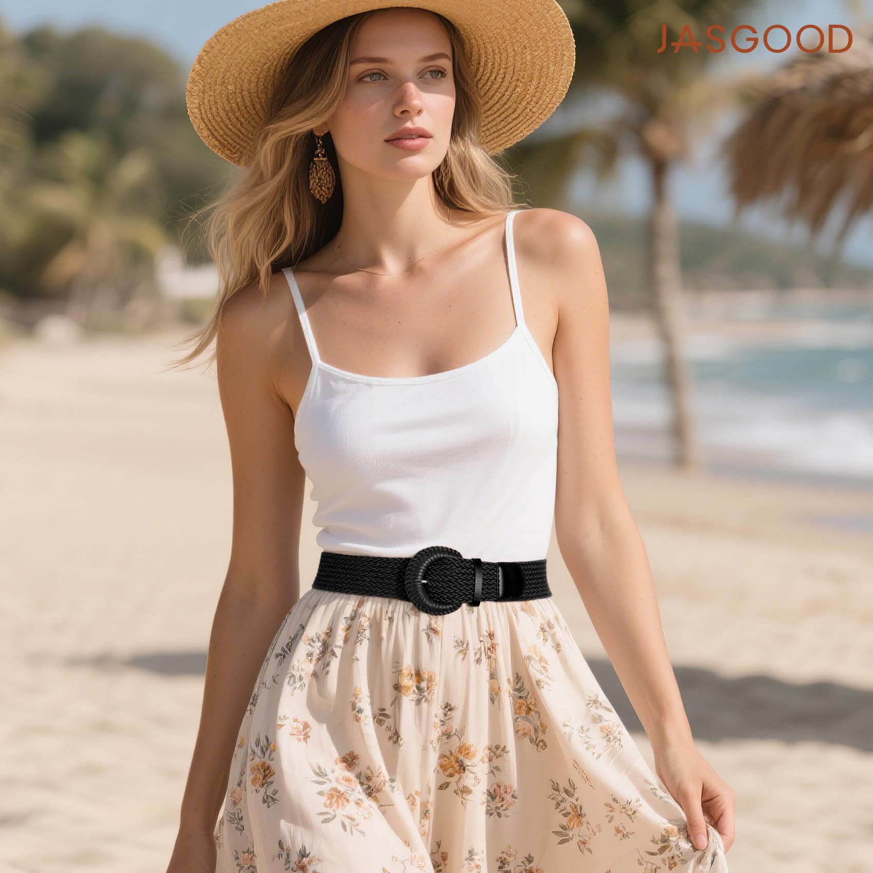
Lighting can make a woven surface look softer, warmer or more pronounced. An editorial image introduces an atmosphere; a close product view helps you inspect the detail itself.
Neither image can confirm how a belt will feel on your clothes. Check the selected product’s dimensions, edges and fastening, particularly if the garment underneath is delicate.
The buying guides can help you separate a visual preference from the practical differences you need to compare.
Read the band, the buckle and the background separately
Start with the band rather than the complete holiday mood. Notice the size of the repeated surface pattern and the amount of contrast it creates with the buckle. Those observations describe appearance without guessing a fibre.
Next cover the band in the photograph and look at the front alone. A light, round decorated frame reads differently from the black wrapped-looking front in the styled image. The images show separate designs, not colour variants of one item.
Now bring the clothing back into the comparison. A floral skirt already has a repeated pattern; a plain shirt gives the belt's surface more room to be noticed. Either relationship can be useful if you know which detail should lead.
For a belt you already own, compare it against one smooth garment and one patterned garment. Change only that background at first, keeping the belt position similar so the surface remains the variable you are studying.
Check the actual product description before choosing care instructions. A straw-like appearance, a wrapped buckle and a woven-looking band do not establish that the products share a material or cleaning method.
Texture can remain a small part of an outfit. You do not need a complete beach setting to use the reference, and an editorial photograph should not decide the season in which you are allowed to enjoy it.
Carry the idea beyond the photograph
Choose one item from your wardrobe as the starting point. A familiar shirt or dress gives you a real reference for colour, surface and belt placement.
Continue through the styling guides for combinations, then use the care guides only after checking the material you actually own.
A change of texture does not have to create an entirely new look. Sometimes it is enough to give a plain outfit another layer of interest while keeping its overall feeling familiar.